

So I haven’t blogged for a while – but things are moving fast, and here are some updates!
Following the suggestions of my mentor, Jim Hall and the GNOME Design Team (specifically Jakub Steiner), I conducted an analysis of GNOME Apps based on Application Menus and Selection Mode as described in the latest GNOME Human Interface Guidelines.
Apps with selection mode:
Boxes, Clocks, Contacts, Documents, Music, Notes, Photos, Videos

Selection Mode in GNOME HIG
After identifying apps with selection mode, I consciously used them over a week and found that I started using the select button more frequently and naturally.
Also, I found three distinct patterns in apps based on their application menus –

Gedit Application Menu (minimal)
1. Minimal App Menu (subset of Help, About, Quit):
Boxes, Brasero, Clocks, Evolution, Geary, Gedit, Maps, Settings, Weather, Font Viewer, Passwords and Keys, Remote Desktop Viewer, Screenshot

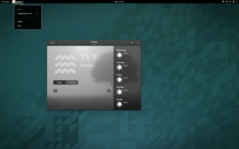
Weather Application Menu (one extra option)
2. App Menu with a couple of additional options (like Preferences, or an app-specific action):
Cheese, Contacts, Documents, Music, Photos, Software, Sound Recorder, Videos, Weather, Calculator, Dictionary, Disks, Document Viewer, Help, Logs, System Monitor, Terminal

Web Application Menu (multiple options)
3. App menu with a multitude of options:
Empathy, Files, Notes, Simple Scan, Web, Archive Manager, Character Map, Image Viewer
This initial analysis will help shape the list of apps to be covered in the usability test – more on that later.
